Here we were engaged in creating corporate and emotional context which had to be clear and common for all the employees. And we talked about this using easy to read symbols.
The symbol which perfectly described all the company’s work and maybe even all IT-industry was the Rubic’s cube and that’s why we applied this symbol to the summer corporate event of CORUS Consulting. Moreover, the motif of corporate identity perfectly manifests itself in this symbol: many different elements that add up to a pretty single whole as a result of the fascinating process.
The colors of the cube structured the program in a special way: the yellow side was the beach, sun and lounges; the green one was about entertaining botany, the white side was about creative master classes, etc.
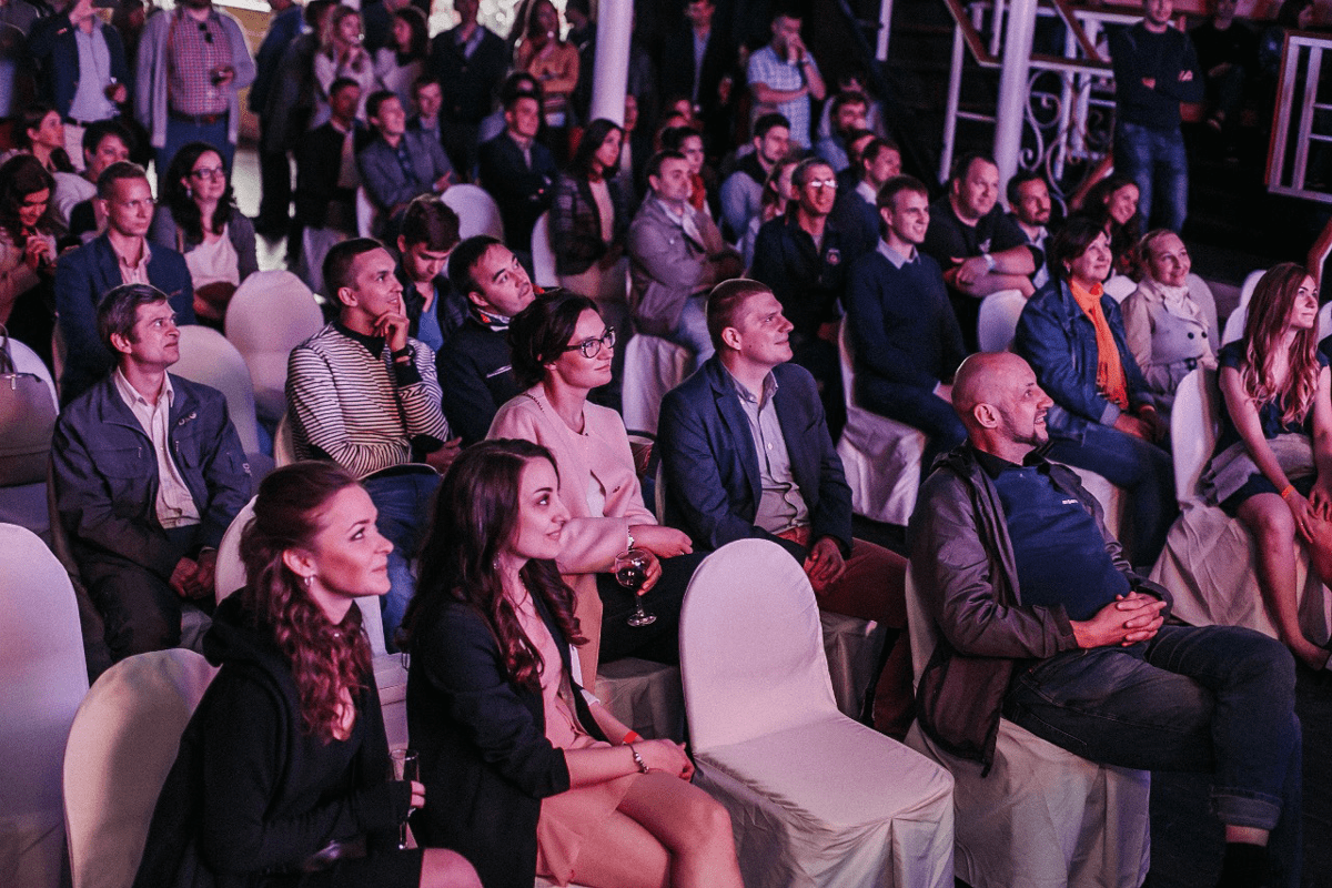
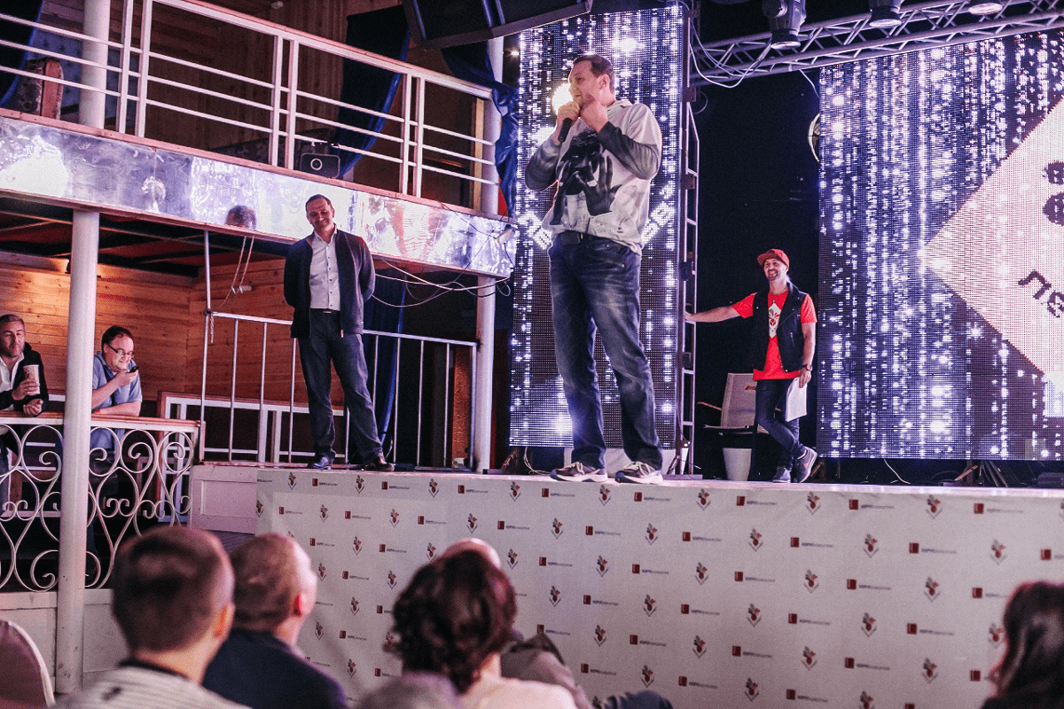
The central place was given to scientific and creative slams: some people performed, some people listened and everyone was engaged with activities. It was the red side of the cube, which resembled the emblem of the company.

